 Last week, Apple released the Public Beta of iOS 12 which I promptly installed only my iPad. I’ve learned from experience the dangers of installing an iOS beta on a phone, but the iPad generally seems to be a safer place to test the new system. What I’m struck by in this year’s release are a few small design changes that give iOS 12 a unique visual feel over past iterations.
Re-Arranged Status Bar

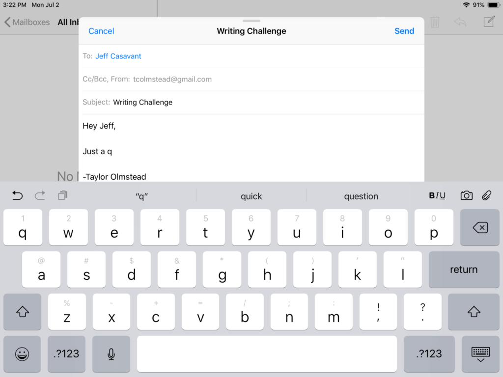
In iOS 12, all iPads receive the divided status bar first seen on the iPhone X. This places the cell/WiFi signal and battery indicator in the top-right corner as usual. It moves the time to the top-left corner and adds the date.
The addition of the date is the first thing I noticed on booting my iPad in iOS 12. I love having it accessible on every screen. Granted, this is a pretty small change, but it is nice to have.
The battery indicator also got a slight redesign to include a lightning bolt overlay when the device is charging. This brings the indicator in line with the Apple Watch and is a great example of design parity across the Apple ecosystem. I’m a fan.
Predictive Text Redesign

Apple added predictive text above the stock on-screen keyboard in iOS 8. It hasn’t seen much love since that first version. For the most part it seems to have been an under-utilized bar of dark grey rectangles with white text showing words that were vaguely relevant to your current sentence.
In iOS 12 this area is given the same grey background color as the rest of the keyboard with the words rendered in black type. The suggestions seems to be a lot more accurate than in previous versions as well. And as outlined below, iOS 12 is just faster than most previous versions, finally making this feature actually quicker than typing out full words with your fingers.
Subtler Control Center
 Last year Apple redesigned the Control Center for iOS 11 and the iPhone X. What used to be a bulky three-pane dialogue at the bottom of the screen became a bubbly full-screen overlay.
On most iOS devices it was still accessible at the bottom of the screen, but on iPhone X it moved to the top-right. Unfortunately it seems the top-right is going to be the winner in this gesture war as Control Center has been moved for all iPads running iOS 12.
However frustrated I may be by the new gesture, I am in love with the subtle new redesign. The background blur effect overlaying your current screen is significantly subtler in iOS 12. It makes flicking open Control Center to adjust volume or brightness feel like the temporary state change it was meant to be all along.
There is also a nice bounce to the on-screen animation that gives a great sense of motion. This combines with multi-touch support to allow dexterous users to pull open the panel with one-finger, hit a button with another and then flick it shut all in one combined gesture.
Bolder Buttons and Controls
A common complaint since the great flattening of iOS 7 has been that Apple’s flagship OS is just too minimal. It seems like each year the design team takes a step back toward detail to appease the masses. iOS 12 is no exception there.
This year many of the buttons and controls throughout the OS have bigger outlines and bolder labels. Notifications, in particular, now have large “X” buttons to close and are labeled with bolder headings.
I think this is great a choice on behalf of the software design group. As screens got bigger the thin lines and slight fonts of iOS 7 started to get lost in the sea of white. These steps toward boldness make the OS more accessible and feel more personable.
Faster Animations Feel More Fun
Apple made a big to do on-stage at WWDC about the performance improvements they’ve made in iOS 12. I was skeptical during the presentation, but one day with the beta was enough to win me over. This feels like the fastest OS my iPad has ever run.
The speed is particularly noticeable during on-screen animations. I know a lot of users are frustrated by the amount of animation involved in simple actions on iOS. With this speed bump though, the characteristic zoom in and out of launching and closing an app feels almost instant. Swiping an app into pop-over is so fast I sometimes hold too long and send it flying to the far side of the screen.
Some of the iPhone X multi-tasking gestures brought over to iPad are a little too sensitive in this first build. Overall though, these speeds make the animations feel like a feature rather than a frustration. It actually makes iOS feel like it looks in the demos: fun.
Many of the initial reports about this year’s iOS release said that it would be focused on refinements rather than new features. That turns out to have mostly been true. And while there are still many more small changes I wish we would have seen, I’m pretty happy with this release.
Apple addressed a number of small design issues that had been bothering me and greatly improved the overall experience of using the platform. I’m excited to see what other surprises surface as the summer beta season continues.
If you’re running the iOS 12 beta on any of your devices I’d love to hear what you think. Drop a comment below with your thoughts.
